
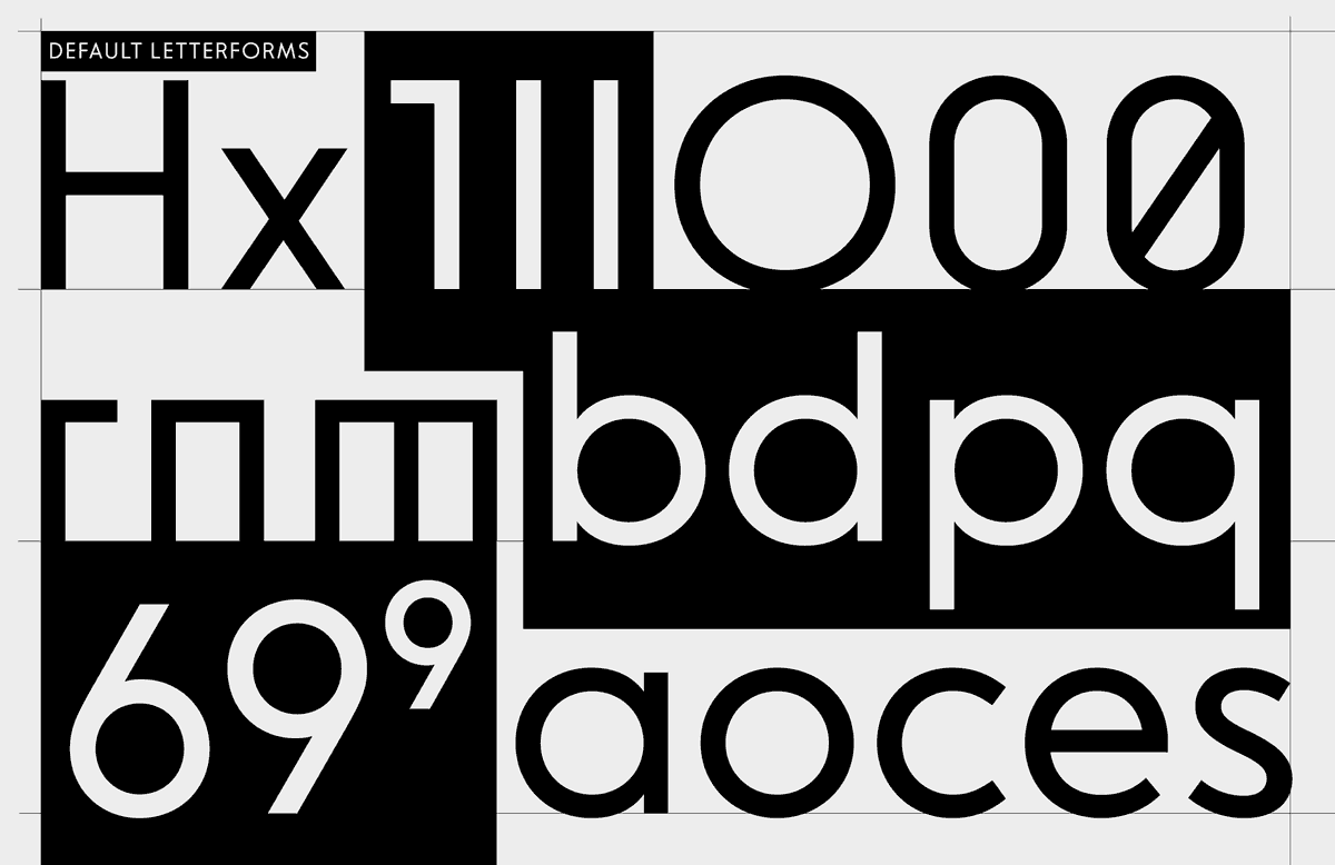
While it is one of many modern typefaces that takes its inspiration from the iconic first Futura sketches by Paul Renner from around 1924 – radical for its time – the goal was not to make a revival. It was to be even more consistent in the geometry of its letterforms while improving Futura’s readability shortfalls. Letter constructions were reimagined, x-height raised, sharp corners slightly cut, lines made as monolinear as possible.
The result is a workhorse typeface in its own right that can carry the clean look of modernism while being a versatile tool customizable to varying design needs and adaptable to different accessibility requirements.
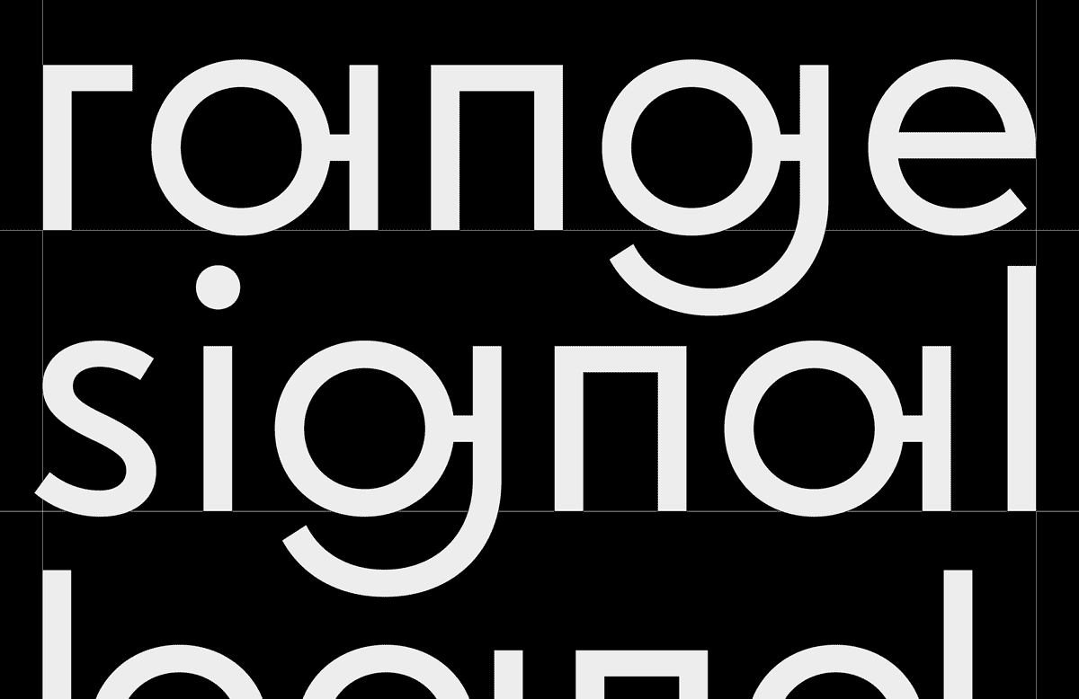
For example, you can choose between the standard right-angled n’s and m’s – a telltale feature of the historic sketch – or Arched Letterforms, which gives the typeface a completely different, more “conventional” flavour without breaking the design.
The Stylized Letterforms emphasize the circle as a symbol of sound waves and broadcasting, also echoing stylistic elements from technical construction and circuit drawings of old radio sets.
The Inclusive Letterforms avoid any mirrored shapes and help make a clear distinction between every single letter. This is a feature that in some ways contradicts the strictly geometric underpinnings of the typeface, and for this reason is usually not really seen in this category of fonts, expanding the geometric sans design space meaningfully.
The font is available as individual Regular and Regular Italic cuts or as a Variable Font for seamless animations. An update with more weights will follow later in 2026.
| Pipeline Stage | C |
| Character Set | Comma Set C |
| Designed | 2020–2026 |
| Released | 2026 |
| Design & Mastering | Anna Cairns |
| Art Direction | Anna Cairns, Flo Gaertner |
Early Futura design (1920s)

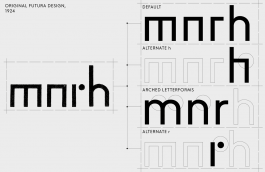

Stylistic Set 1: Arched letterforms

Stylistic Set 2: Inclusive letterforms

Stylistic Set 3: Stylized letterforms

Stylistic Set 4 + Contextual Alternative: Alternate Asterisk

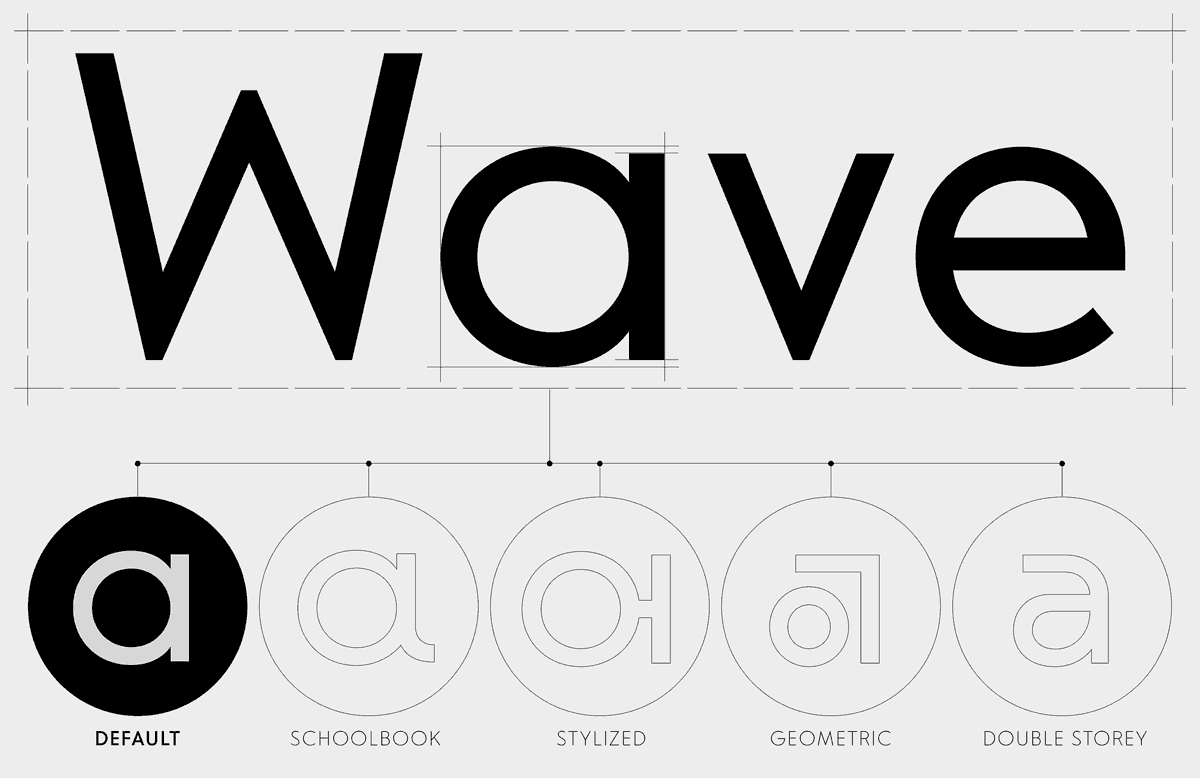
Stylistic Set 5: Alternate Schoolbook a

Stylistic Set 6: Alternate Double-storey a

Stylistic Set 7: Alternate Geometrical a

Stylistic Set 8: Alternate g

Stylistic Set 9: Alternate h

Stylistic Set 10: Alternate j

Stylistic Set 11: Alternate l

Stylistic set 12: Alternate r

Stylistic Set 13: Alternate t

Stylistic Set 14: Alternate y

Stylistic Set 15: Alternate M

Stylistic Set 16: Alternate Commas + Quotations

Contextual Alternate

Tabular figures

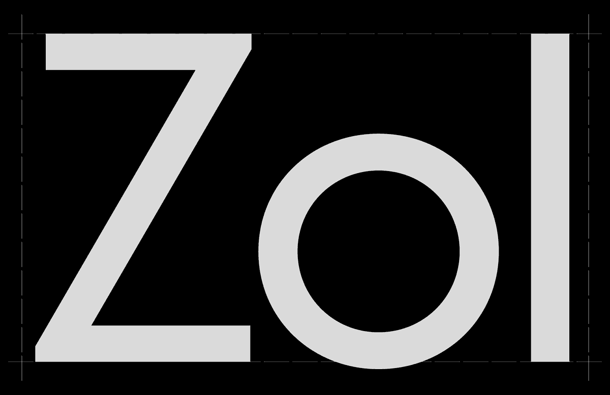
Slashed zero

Inferior & superior figures

Ordinals

Circled numbers

Black circled numbers
Large optical size
A large x-height in relation to the ascender and uppercase heights means that the font looks larger – and thus, is more legible – when set in the same size as a font with a lower x-height (such as Futura), especially at a smaller scale.

CMM Radio
Futura
Shape differentiation
For optimal legibility and comprehension, each shape must be unique and clearly distinguishable.

CMM Radio
CMM Radio +
Inclusive Alternates
Futura
Avoid mirroring
With conditions such as dyslexia, readers may easily confuse mirrored shapes. CMM Radio compromises between geometrical construction and legibility by only allowing mirroring when shapes clearly sit on different heights (b/p).

CMM Radio
CMM Radio +
Inclusive Alternates
Futura
Consistent stroke width
Consistent stroke widths and low stroke contrasts make the typeface stable and legible at all sizes.

CMM Radio
Open counters
The counters of open shapes such as c, e, s and g (+ double-storey a’s) should not be too closed visually to avoid misreadings, especially in small sizes.

CMM Radio
Futura
Relaxed spacing
A typeface is easier to read when it has comfortable spacing. The characters should not sit too tightly or even run into each other, especially when set in small sizes.

CMM Radio
Futura
Tiny size comparison sample

CMM Radio
CMM Radio +
Inclusive Alternates
Futura

Stylistic Set 1: Arched letterforms
Stylistic Set 2: Inclusive letterforms
Stylistic Set 3: Stylized letterforms
Stylistic Set 4 + Contextual Alternative: Alternate Asterisk
Stylistic Set 5: Alternate Schoolbook a
Stylistic Set 6: Alternate Double-storey a
Stylistic Set 7: Alternate Geometrical a
Stylistic Set 8: Alternate g
Stylistic Set 9: Alternate h
Stylistic Set 10: Alternate j
Stylistic Set 11: Alternate l
Stylistic set 12: Alternate r
Stylistic Set 13: Alternate t
Stylistic Set 14: Alternate y
Stylistic Set 15: Alternate M
Stylistic Set 16: Alternate Commas + Quotations
Contextual Alternate
Tabular figures
Slashed zero
Inferior & superior figures
Ordinals
Circled numbers
Black circled numbers
Large optical size
A large x-height in relation to the ascender and uppercase heights means that the font looks larger – and thus, is more legible – when set in the same size as a font with a lower x-height (such as Futura), especially at a smaller scale.
CMM Radio
Futura
Shape differentiation
For optimal legibility and comprehension, each shape must be unique and clearly distinguishable.
CMM Radio
CMM Radio +
Inclusive Alternates
Futura
Avoid mirroring
With conditions such as dyslexia, readers may confuse mirrored shapes more easily. CMM Radio compromises between geometrical construction and legibility by only allowing mirroring when shapes clearly sit on different heights (b/p).
CMM Radio
CMM Radio +
Inclusive Alternates
Futura
Consistent stroke width
Consistent stroke widths and low stroke contrasts make the typeface stable and legible at all sizes.
CMM Radio
Open counters
The counters of open shapes such as c, e, s and g (+ double-storey a’s) should not be too closed visually to avoid misreadings, especially in small sizes.
CMM Radio
Futura
Relaxed spacing
A typeface is easier to read when it is comfortably spaced. The characters should not sit too tightly to not visually run into each other, especially when set in small sizes.
CMM Radio
Futura
Tiny size comparison sample
CMM Radio
CMM Radio +
Inclusive Alternates
Futura